Invincible
Fan-made title sequence
Project
Apr 2025 - May 2025
Role
Motion Designer
Company
Personal Project
Tools
Illustrator, Photoshop, Aftereffects, Opentoonz
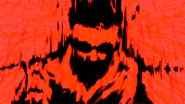
The Invincible fan animation title sequence features bold, dynamic visuals that capture the energy and style of the series. With smooth motion, vivid colors, and dramatic timing, it sets an exciting tone while highlighting key characters and themes.
The Invincible fan animation title sequence features bold, dynamic visuals that capture the energy and style of the series. With smooth motion, vivid colors, and dramatic timing, it sets an exciting tone while highlighting key characters and themes.
Problem
Invincible doesn't have it's own title sequence.
While the series is known for its brutal, graphic moments, it’s also deeply motivational, centered on the main characters relentless drive to keep going, no matter how hard he gets hit. The challenge was to capture both extremes visually: the raw impact of its violence and the emotional core of perseverance, all while staying true to the show’s tone and pacing.
Resources
The sequence was primarily created in After Effects, with Illustrator used to build out the initial graphic elements and layout drafts.
For the second, more hand-drawn half of the sequence, I initially experimented with Photoshop for frame-by-frame animation, but eventually transitioned to OpenToonz for more control and flexibility in the drawing process. This combination of tools allowed for a balance between clean, vector-based design and expressive, hand-drawn animation—mirroring the duality of the show’s tone.
Josef Alber’s “Interaction of Color” was my primary source for when my project was still focused on learning color theory.
The Temperature Blanket was a big influence on my final project. The website generates a color palette based on the weather of a certain area. It’s what inspired me to link my project to the circadian rhythm and assigning shades of violet.
In the final outcome, the hero animation was created using a break down video by MotionXP.
The sequence was primarily created in After Effects, with Illustrator used to build out the initial graphic elements and layout drafts.
For the second, more hand-drawn half of the sequence, I initially experimented with Photoshop for frame-by-frame animation, but eventually transitioned to OpenToonz for more control and flexibility in the drawing process. This combination of tools allowed for a balance between clean, vector-based design and expressive, hand-drawn animation—mirroring the duality of the show’s tone.

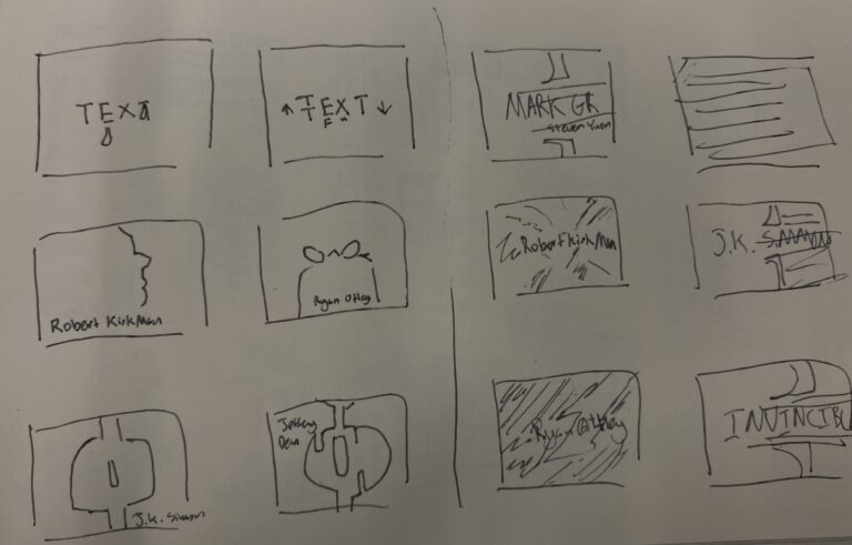
01 Initial Sketches
02 UX
& Structure
For the storyboard, I started with two main ideas to bring the Invincible fan animation to life. The first focused using silhouettes to introduce the characters, while the second leaned more into dramatic character introductions and emotional beats. I sketched both to explore different storytelling approaches before deciding which direction best captured the tone I wanted.
For the storyboard, I started with two main ideas to bring the Invincible fan animation to life. The first focused using silhouettes to introduce the characters, while the second leaned more into dramatic character introductions and emotional beats. I sketched both to explore different storytelling approaches before deciding which direction best captured the tone I wanted.
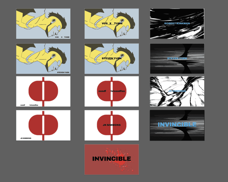
02 Storyboard
I ended up combining both initial ideas for the storyboard, blending fast-paced action with dramatic character moments. I also took inspiration from the second half of the Castlevania trailer to enhance the mood and pacing, aiming for a balance between excitement and storytelling.
I ended up combining both initial ideas for the storyboard, blending fast-paced action with dramatic character moments. I also took inspiration from the second half of the Castlevania trailer to enhance the mood and pacing, aiming for a balance between excitement and storytelling.
03 Roughcut
I initially tried doing frame-by-frame animation in Photoshop, but it became clear it wasn’t the most efficient for this project. So, I switched to OpenToonz, which offered better tools and workflow for handling the animation smoothly.
I initially tried doing frame-by-frame animation in Photoshop, but it became clear it wasn’t the most efficient for this project. So, I switched to OpenToonz, which offered better tools and workflow for handling the animation smoothly.

04 Outcomes
The final animation successfully combines dynamic action with strong character moments, capturing the spirit of the original series. Switching to OpenToonz improved the animation quality and made the process more efficient, resulting in a polished and engaging title sequence.
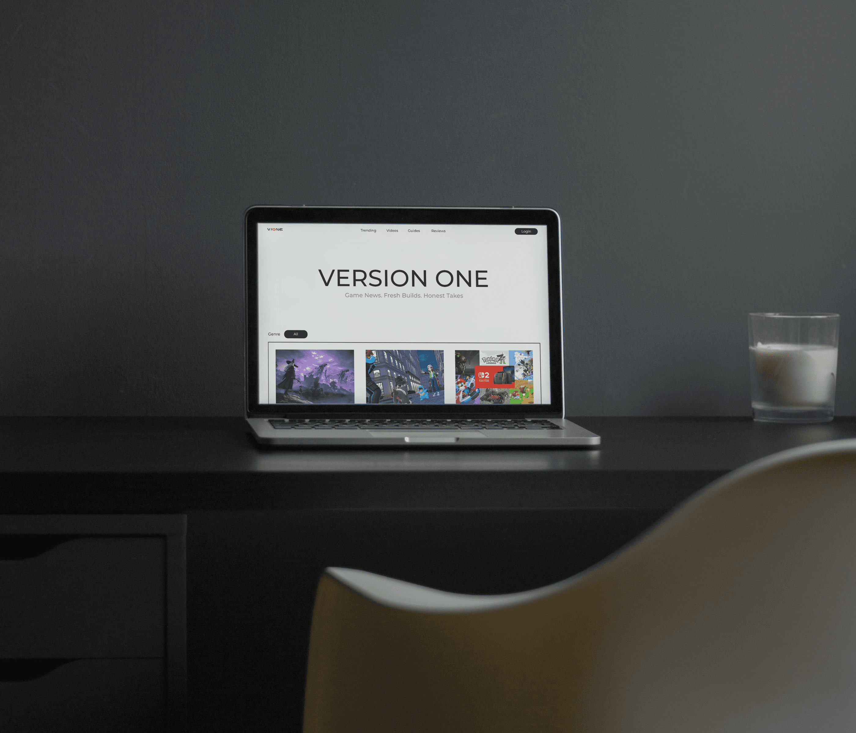
The final project resulted in an interactive website that showcases 45 thoughtfully curated violet shades linked to the circadian rhythm. Users can easily explore and create personalized color palettes that resonate emotionally and visually. The design balances minimalism with expressive color use, encouraging reflection and connection through color. This project highlights violet’s potential as a versatile and meaningful design.