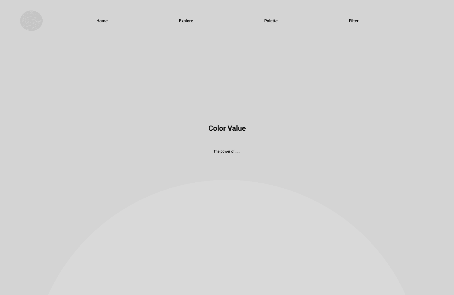
The Color “Violet”
A violet-only design study
Project
Aug 2024 - May 2025
Role
UX UI Designer
Company
Personal Project
Tools
Figma, Adobe Creative Suite (Photoshop, Illustrator, InDesign, Aftereffects), and Framer
The website is a personal visual archive that combines structured grid layouts with spontaneous, process-driven design experiments. Using tools, geometric forms, and typography, The Color “Violet” explores how designing with 45 shades of one color can shape mood, rhythm, and visual storytelling. Showing the conceptual range of violet through multimedia design.
I challenged myself to create in Illustrator and Photoshop without a set plan, exploring ideas through uncertainty. This led to 72 small-format designs experimenting with texture, rhythm, and form, which became the foundation for a modular system focused on accessibility and interaction.
The website is a personal visual archive that combines structured grid layouts with spontaneous, process-driven design experiments. Using tools, geometric forms, and typography, The Color “Violet” explores how designing with 45 shades of one color can shape mood, rhythm, and visual storytelling. Showing the conceptual range of violet through multimedia design.
I challenged myself to create in Illustrator and Photoshop without a set plan, exploring ideas through uncertainty. This led to 72 small-format designs experimenting with texture, rhythm, and form, which became the
foundation for a modular system focused on accessibility and interaction.
Problem
According to the National Institutes of Health (NIH), purple is often seen as a neutral hue with limited emotional association. I saw this flexibility as an opportunity to create.
While violet is a spectral color with a defined place in the visible light spectrum, purple is a perceptual blend—our brain's interpretation of red and blue light combined. Yet in everyday language, “purple” has become the umbrella term for this entire color family.
This gap between scientific distinction and cultural usage, combined with purple’s emotional neutrality, inspired me to explore how design could give the color more resonance, rhythm, and personal significance.
Resources
Josef Alber’s “Interaction of Color” was my primary source for when my project was still focused on learning color theory.
The Temperature Blanket was a big influence on my final project. The website generates a color palette based on the weather of a certain area. It’s what inspired me to link my project to the circadian rhythm and assigning shades of violet.
In the final outcome, the hero animation was created using a break down video created by MotionXP.
Josef Alber’s “Interaction of Color” was my primary source for when my project was still focused on learning color theory.
The Temperature Blanket was a big influence on my final project. The website generates a color palette based on the weather of a certain area. It’s what inspired me to link my project to the circadian rhythm and assigning shades of violet.
In the final outcome, the hero animation was created using a break down video by MotionXP.
01 UX & Structure
02 UX
& Structure
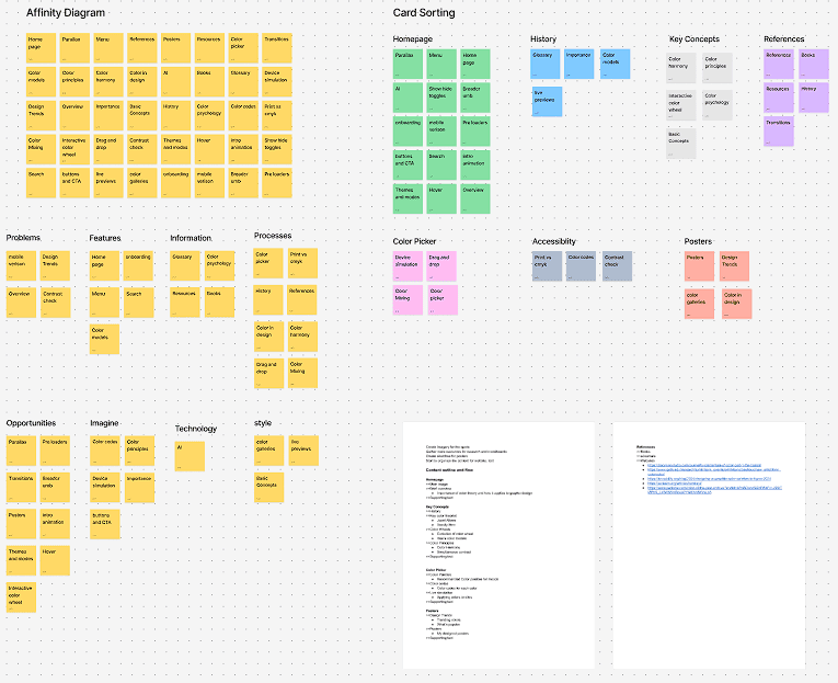
Card sorting helped shape a clear information architecture by revealing how users intuitively group the 45 violet shades. This guided the site’s structure, enabling smooth navigation through the circadian rhythm–based palette and supporting emotionally driven palette creation.
Card sorting helped shape a clear information architecture by revealing how users intuitively group the 45 violet shades. This guided the site’s structure, enabling smooth navigation through the circadian rhythm–based palette and supporting emotionally driven palette creation.

02 Wireframes
I created wireframes to map out the layout and flow based on the information architecture. They defined key interactions and content hierarchy, prioritizing clarity and ease of use, and ensured users could explore violet shades and build personalized palettes without distraction.
I created wireframes to map out the layout and flow based on the information architecture. They defined key interactions and content hierarchy, prioritizing clarity and ease of use, and ensured users could explore violet shades and build personalized palettes without distraction.

03 Testing & Iteration
Usability testing took place informally during a class session where everyone walked around to view and share their in-progress work.
Based on this feedback, I made targeted adjustments: simplifying navigation, improving instructions, and fine-tuning layout decisions to better support a smooth, emotionally engaging experience. This iterative feedback loop was essential in shaping a more thoughtful and user-friendly final product.
The final project resulted in an interactive website that showcases 45 thoughtfully curated violet shades linked to the circadian rhythm. Users can easily explore and create personalized color palettes that resonate emotionally and visually. The design balances minimalism with expressive color use, encouraging reflection and connection through color. This project highlights violet’s potential as a versatile and meaningful design element.


04 Visual Guide
The visual identity uses black as a grounding element, paired with three bright shades of violet to create contrast, rhythm, and emotional depth throughout the interface.
The visual identity uses black as a grounding element, paired with three bright shades of violet to create contrast, rhythm, and emotional depth throughout the interface.
I chose Soulcraft Wide as the display font for its bold, extended letterforms that echo the assertiveness and uniqueness of violet as a singular system. Its industrial, structured feel contrasts with the softness of the color palette, creating a tension that draws attention and reinforces the idea of violet as both veery emotional and functional.
For body text, I used Montserrat for its clean, modern geometry and excellent readability.


05 Outcomes
The final outcome is an interactive website featuring 45 curated violet shades aligned with the circadian rhythm. It allows users to explore and build personalized palettes that evoke both emotional and visual resonance. The design blends minimalism with expressive color, inviting reflection and showcasing violet as a flexible, impactful design system.
The final project resulted in an interactive website that showcases 45 thoughtfully curated violet shades linked to the circadian rhythm. Users can easily explore and create personalized color palettes that resonate emotionally and visually. The design balances minimalism with expressive color use, encouraging reflection and connection through color. This project highlights violet’s potential as a versatile and meaningful design.
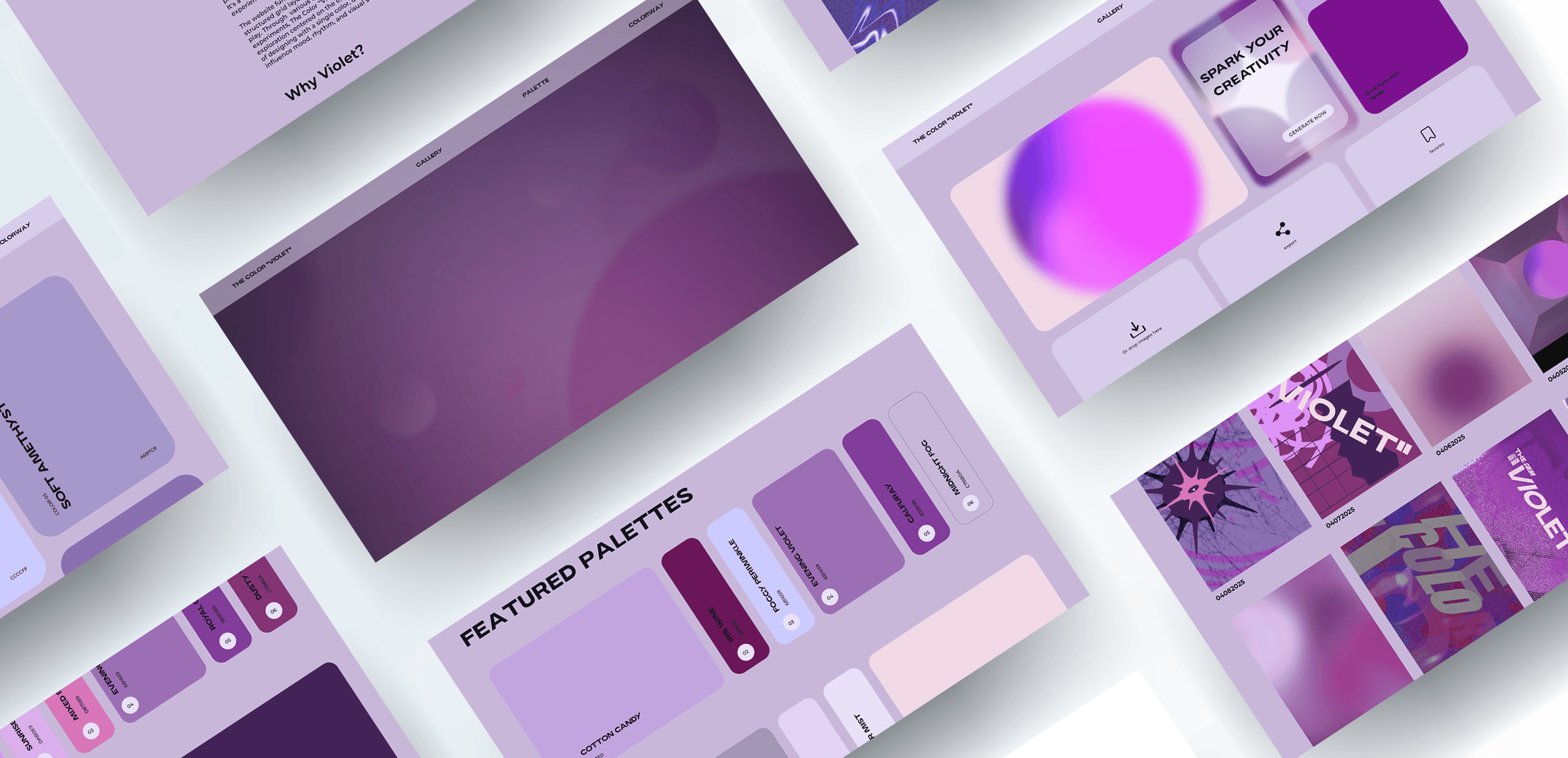
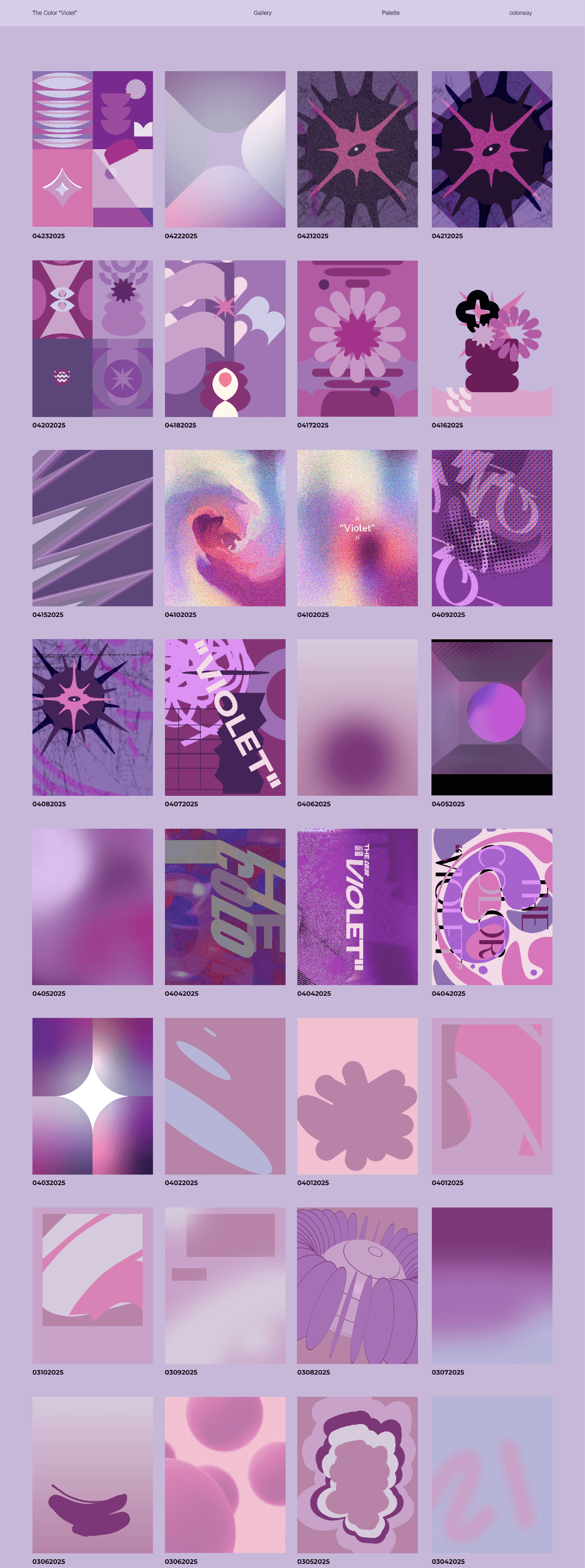
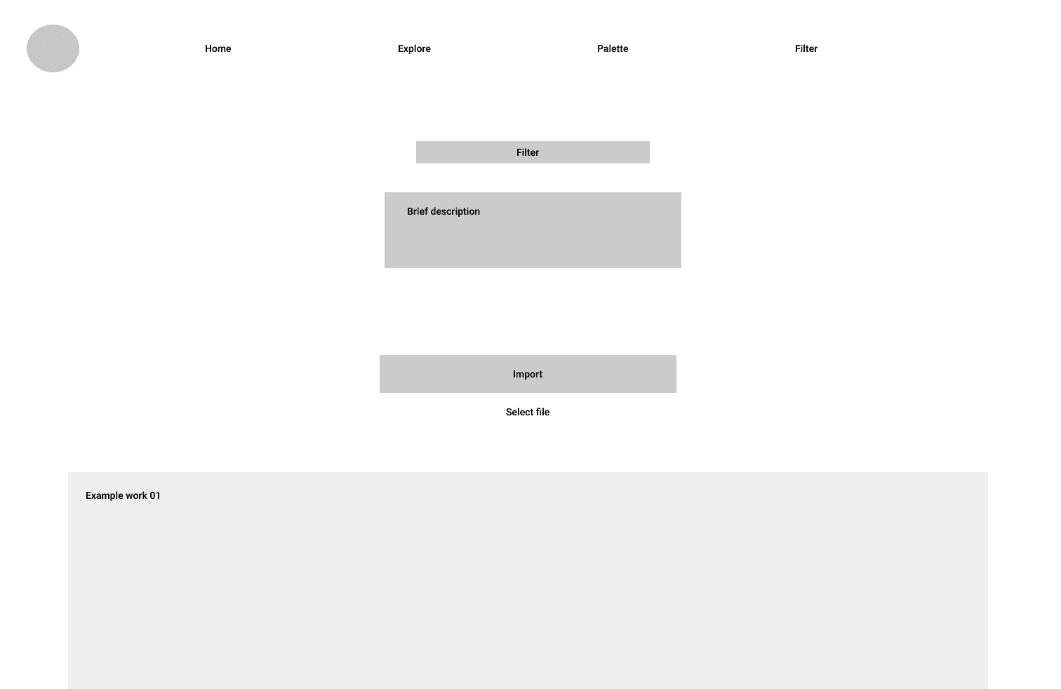
Gallery
I created a gallery with 72 design experiments currently, using different mediums like type, motion, and texture. These were a way for me to test how violet could work in different styles and moods, and they helped me explore the color’s flexibility through hands-on making.
I created a gallery with 72 design experiments currently, using different mediums like type, motion, and texture. These were a way for me to test how violet could work in different styles and moods, and they helped me explore the color’s flexibility through hands-on making.
Gallery

Generator
The final site includes a color generator that helps users create their own palettes using 45 violet shades tied to the circadian rhythm. It’s designed to feel intuitive and personal—guiding users through a process of selecting colors based on time, mood, or visual preference.
The final site includes a color generator that helps users create their own palettes using 45 violet shades tied to the circadian rhythm. It’s designed to feel intuitive and personal—guiding users through a process of selecting colors based on time, mood, or visual preference.
The final site includes a color generator that helps users create their own palettes using 45 violet shades tied to the circadian rhythm. It’s designed to feel intuitive. Guiding users through a process of selecting colors based on time, mood, or visual preference.
Generator

Palettes
A section for popular palettes, so users can browse and get inspired by the combinations others are drawn to. It turns the palette-building process into something both creative and shared.
A section for popular palettes, so users can browse and get inspired by the combinations others are drawn to. It turns the palette-building process into something both creative and shared.
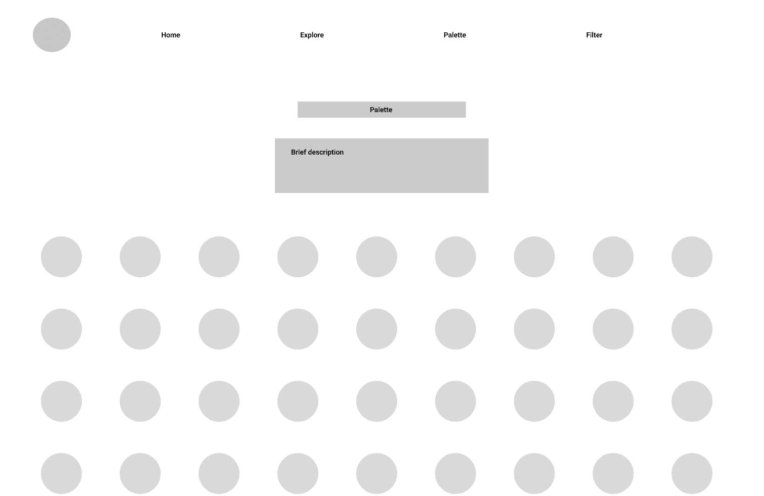
Palette

Colorway
Colorway section, where I organized the 45 violet shades into smaller, themed sets. Each colorway highlights a specific mood, energy, or time of day, helping users understand how violet can shift depending on context.
Colorway section, where I organized the 45 violet shades into smaller, themed sets. Each colorway highlights a specific mood, energy, or time of day, helping users understand how violet can shift depending on context.
Colorway